
Awekas Map User Manual
Map update Q4 2020
The latest update to the Awekas map brings a new set of features as well a visual overhaul. The main new feature is the overlay. With the overlay you can display interpolated values for some sensors on the stations as well as wind animations. These overlays are not only available for live data but also for the last 24 hours. For a more in-depth explanation of the new features read the guide below.
Overview
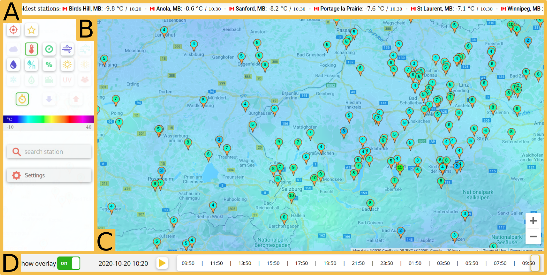
A. Info bar | B. Sidebar | C. Map | D. Overlay controls
The following manual will guide you though the new Awekas map. The general page is depicted on figure 1. The page consists of different elements: Info bar (A), map controls (B), map (C) and overlay controls (D). Note that the overlay controls are greyed out when the page is loaded because the overlay is turned off. Switch it on the make them accessible.
Notes for mobile users: The sidebar is collapsed when loading the page. To open it press the orange button on the lop left of the map. The Info bar is hidden by default to save screen space. To show it switch on the corresponding option in the settings.
General Controls
Zooming and panning the map works as you are used to with other online maps. You can click and drag (touch and drag on mobile) to pan the map and use the scroll wheel (pinch on mobile) to zoom the map. If the sidebar containing the map controls is collapsed access it with the orange button on the top left corner of the map.
The map is primarily controlled with the sidebar (figure 1.B). The sidebar can be seen in figure 2. On very top of the sidebar are two buttons on the left side for zooming to your current location. If you have not given the browser the permission to access the location this feature does not work. The next button reloads the page with the current map position encoded in the URL. This feature is useful, when you want to save the current map position as a bookmark.
Below are the sensor buttons. By clicking on one of these buttons you can choose the sensor you want to see on the map. Available sensors are temperature, air pressure, wind speed, gust speed, daily rain, rain rate, humidity, solar radiation, brightness, snow height, dew point and UV index. Additionally the currently reported weather condition, webcams and station status (online/offline) can be displayed. Directly below are the buttons to switch between current (live) values, today's minimum and maximum.
Also in the side bar is a field to search for an location. Simply enter the name of the location to search for it.
The last entry in the sidebar is the settings button. Press it to open the settings.
Markers & Bubbles
Markers are drawn on the map for every station that has a current value for the selected sensor. Note that not every station is equipped with every sensor. The markers are color coded with it's value. The key for the color can be seen in the side bar. When moving the mouse over a marker a bubble with a short summary of the station appears.
When the overlay is activated the markers are replaced with small dots by default, when you have zoomed out. You can change this behavior in the settings. More information can be found in the settings section below.
Station Sidebar
The bubbles give some basic information at a glance. For more in-depth data you can click on a marker to open the station sidebar for this station. When opening the station sidebar any other sidebar is closed. In the sidebar the station's data and graphs can be seen. It also gives access to the stations instrument page.
Overlay
The overlay gives you a whole new way to view weather data on the Awekas map. When the overlay is turned on interpolated values are shown on the map.
Controlling the overlay
You can switch the overlay on by toggling the "Show overlay" button on the bottom left corner of the page. On mobile, this button is located in the sidebar. Again the requested sensor is controlled with the sidebar. Note however that the overlay is not available for all sensors and only the available sensors are selectable in the sidebar.
The overlays are available for live data and the last 24 hours. To navigate through time use the scroll bar below the map in the overlay controls. The left end of the scroll bar is 24 hours ago, the right on is the current time. The intervals of the time steps can be set in the settings. The date and time of the current slider position are shown to the left of it (mobile: inside of it).
By pressing the play button a time lapse animation is displayed. If the slider position is on the very right (i.e. present) the time lapse starts on the very right (i.e. 24 hours ago.). If the slider is somewhere else it starts at this position. Before showing the time lapse the data is buffered. Depending on the selected intervals on the time slider and your internet bandwidth this may take a while. By decreasing the temporal resolution (i.e. make the intervals bigger) less data has to be loaded and the loading speeds up.
Additional remarks
We calculated the interpolation based on stations of the Awekas network. We can only generate these interpolations for regions where the station density is high enough. Currently Europe and North America. The system is flexible however, so we can adapt these regions borders or add new regions when more stations join the network. Also keep in mind that only stations on ground and on land are part of the network. We use public temperature and air pressure data from METAR stations to enhance these two overlays.
Settings
To access the settings press the settings button in the sidebar.
- Units: Select the units of the data. Choose between ISO (metric units) or imperial units.
- Wind units: Select the wind units. Kilometers per hour (km/h), miles per hour (mph), knots (kt) and meters per second (m/s) are available.
- Automatic scaling: The color scale is adapted to the currently reported values, when turned on or static when turned of.
- Your timezone: Requested timezone.
- Info bar: Behavior of the info bar. "Off" hides the info bar, "selected countries" shows info for the countries specified with the setting "Info bar countries" and "on map" shows info for the countries currently visible on the map.
- Info bar countries: Select the countries for which you want to see info in the info bar.
- Maximum data age: Data for the markers has to be newer than the time specified with this setting.
- Map type: Type of the map the data is drawn on. Switch between "roadmap", "hybrid" and "terrain".
- Display marker value: Whether or not to display the value inside the markers. (Note: not available on Internet Explorer).
- Hide zero value stations: Hides stations with 0 values. E.g. useful for rain, wind, etc.
- Open instrument page in extra tab: Whether or not to open the instrument page in a new tab or not when it is clicked in the station sidebar.
- Display day/night line: Whether or not to draw the day night line on them map.
- Temporal resolution: Select the spacing of time points (i.e. positions on the time slider). A lower settings gives a smoother time laps animation and temporal scrolling but needs more data and loading time. Higher settings are recommended for low bandwidth internet connections.
- Overlay render resolution: Select the relative resolution of the wind animation and barometric plot. "1x" (i.e. screen resolution) by default. Select "2x" for oversampling (sharper - more demanding). Select "0.5x" for subsampling (blurrier - less demanding). "0.5x" is recommended for weak systems.
- Framerate limit: Target framerate of the wind animation. "30" by default. Select a higher value for a higher target framerate (smoother animation). Select a lower value on weak systems for a more stable experience.
- Wind particle size: Size (width) of individual wind particles.
- Wind particle length: Length of individual wind particles.
- Wind particle count: Number of wind particles drawn on screen. More particles require higher computational resources. "Less" is recommended for weak systems.
- Marker appearance when overlay activated: Behavior of the markers when the overlay is on."Minimal" (default) displays small dots instead of the markers, "full" displays the normal markers and "hidden" hides the markers completely.
- When zoomed and overlay activated: Always show full markers: When turned on: when the zoom level is high enough the markers are shown despite the setting above. When turned off: Markers are drawn according to the setting above.